


Mobile Responsive Checks
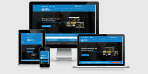
Is your website mobile-friendly?
Does it swiftly load on various mobile devices?
Does it function smoothly across different devices?
Is transacting with you a hassle-free process?
Is reaching out to you easy?
Typically, we find a handful of issues that could be hindering your conversion rates.
What do we mean by a ‘conversion’? Well, imagine this: you have a visitor actively browsing your website at this moment.
When they reach out to identify themselves, that’s a conversion – a lead that you can nurture into a potential client. Pretty straightforward, right?
Mobile traffic can account for over half your site visits, depending on what you’re selling, who you’re selling to and their respective demographics.
Any website we create is optimized for mobile devices, but it’s still essential to test them pre-launch.
Smart Actions:
- Test your website’s appearance and performance on your mobile phone.
- Rotate your phone to the landscape mode and see if your website still works as intended.
- Use a tablet to access your website, in both portrait and landscape orientation. Does everything look in order?
- Try viewing your website on a friend’s phone, preferably a different model. Does everything still work?
- Is there a ‘Call Now’ button visible throughout the website, regardless of how much you scroll?
Then there’s ‘Mobile Optimisation’.
While most modern websites are mobile-friendly or mobile-responsive, mobile optimisation takes it a step further.
Mobile optimisation involves fine-tuning the mobile version of your website for optimal performance, leading to better results.
In simple terms, it’s about crafting the perfect balance between desktop and mobile versions. For instance, we might remove large chunks of text on a mobile device to make the content more digestible for mobile users. Does that make sense?
If you’re interested in a comprehensive review of your website, you can request a website audit here.
DO YOU NEED HELP WITH THAT?
CALL 08 9439 2820 NOW OR SIMPLY FILL IN THE FORM BELOW
Related Posts

Mobile First Indexing | 5 Must Knows


Why Your Website is Not Converting Visitors to New Clients

Marketing Paralysis… the Struggle is Real!
