Are You As Easy To Contact As You Think?
How accessible are you to your website visitors?
Is it truly effortless to reach out to you?
Don’t overlook this! Leave no stone unturned and verify it yourself!
With the shift in web design trends leaning towards enhancing ‘user experience design’ rather than just following traditional webpage building techniques, accessibility has become increasingly important.
Gone are the days when the ‘Contact us’ page was the primary source for information.
Your most essential contact number should be easily visible, ideally at the top right of the page.
Can you see this number clearly on a mobile device? Check it out and see what your prospective clients witness.
While scrolling, this number should be visible AT ALL TIMES when using a mobile device.
Let’s shift gears back to checking your website on a PC (comparing desktop and mobile views).
Thanks to the introduction of website ‘footers’ (an area displayed at the bottom of your website regardless of the page you’re on), your contact details should be omnipresent on every page.
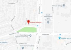
If you’re operating a brick-and-mortar business, your address, including a map, should be featured in the footer.
Of course, this information should also be available on your ‘Contact Us’ page, but let’s make it effortless for people to locate you at just a glance.
Additionally, a shortcut to your ‘Contact Us’ page should be inserted in the ‘footer’ and the menu.
Imagine if a visitor scrolls to the bottom of your website and then has to scroll back up to find your contact page – that’s not a desirable user experience.
In this era, people have shorter patience and lower tolerance; hence, we can’t risk losing potential business.
Aim to make it simple for people to reach out to you, regardless of the device they’re using.
We hope this is helpful.
Smart Actions:
- Visit your website using a PC (desktop) and verify your phone number’s visibility.
- Access your website on a tablet and a mobile phone.
- Check whether the phone number is visible at all times on both the tablet and mobile phone.
- Confirm if your website has a footer.
- Check if relevant contact details are displayed in the footer.
Are the address, contact button, and mini-map present?
Could a ‘User Experience’ audit be beneficial?


